Heading headache
I found a bit of code on a site that befuddled me. I could hardly believe what I read. I showed it to others in the accessibility community and they were as astonished as I was. We were all chuckling. The snippet of code was indeed a doozy. But some developer wrote it. He thought it was the right thing to do. Let’s look at this snippet and explain why it doesn’t work.
The offending snippet
<h2 class="h3" role="heading" aria-level="1">Some heading</h2>
Why are accessibility specialists rolling their eyes at this? Because the code undermines what the heading tag does. But let’s pull this one apart a bit more.
Headings – A quick recap
- HTML headings serve to define the structure and hierarchy of a page’s content.
- There are, as you probably know, 6 levels of headings.
- Headings are not headers.
- Headings are hierarchical. That hierarchy needs to be available visually as well as programmatically.
- Heading levels should not be skipped.
- Screen reader users can use headings to “skim” a page’s content.
- Screen reader users can jump from one heading to the next
- Screen reader users can load a list of headings and then jump to a specific heading.
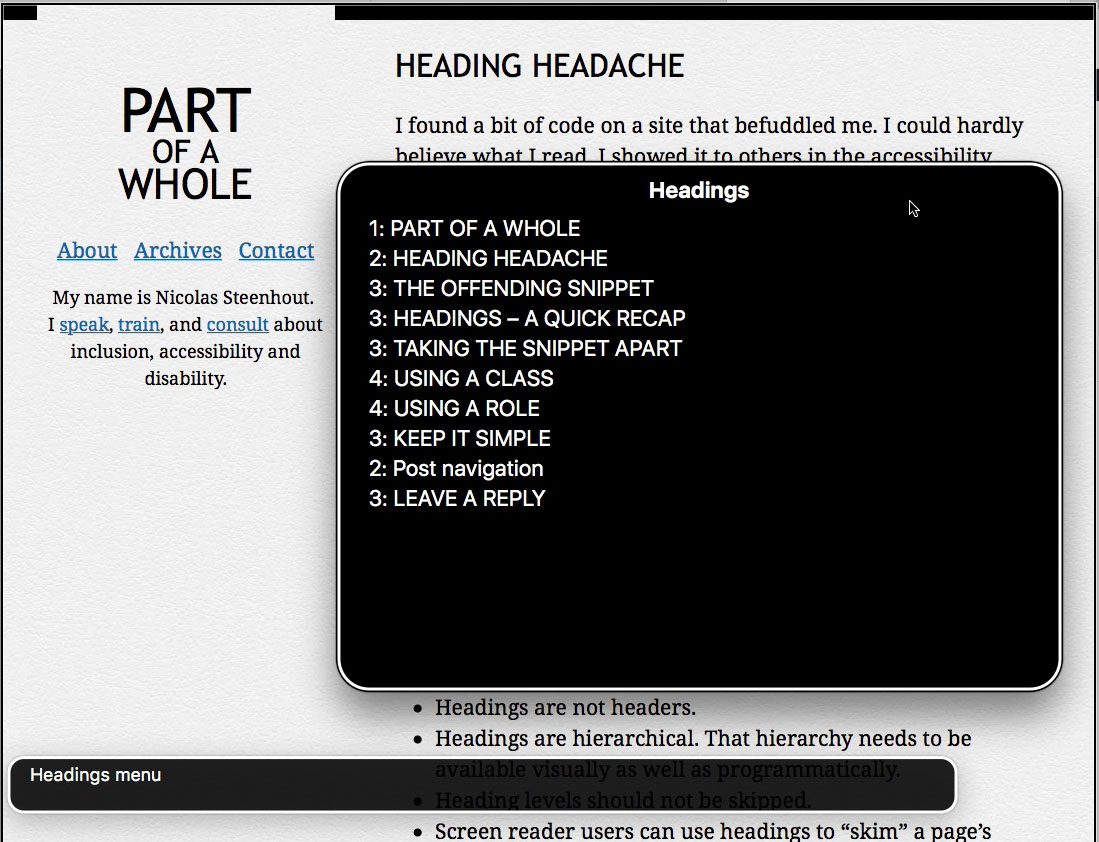
 This is what a heading list looks like in VoiceOver
Taking the snippet apart
Using a class
There’s nothing wrong with assigning headings classes. There are plenty of uses for that. In this case, however, the class is h3 yet the heading level is 2. The assumption here is that they wanted to style h2 to look like h3. This is a problem because of the impact it has on sighted users relying on headings to understand the page’s hierarchy.
Using a role
There’s nothing wrong with assigning roles to HTML elements. An added role should not change the semantic meaning of an HTML element. Here it’s fine because the role is “heading”, and the element is a heading. In fact, it is redundant to use the heading role on a heading tag. But it doesn’t hurt.
The problem is that the attribute aria-level was used to define a different heading level than the tag’s. And it’s a bad idea to change the nature of a tag. If you want a h1, then use a h1. If you use an h2, then don’t try to force it to behave like a h1.
Keep it simple
Use existing HTML tags whenever possible. Don’t try and make them behave differently than what they are supposed to. Keep it simple, eh?
Here’s what it could have looked like:
<h2 class="display1">Some heading</h2>