When branding colours conflict with colour contrast requirements
I often encounter sites with poor colour contrast between text and background. The client tells me that the colours can’t be changed because they are part of their brand guidelines. A discussion usually follows. Often, I’m able to convince the client that changing the hue of a specific colour on their site will not have a significant impact on their branding. Here are the points I use to explain why there isn’t going to be a significant impact.
What is “proper” contrast?
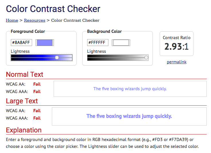
I won’t go into details here. You can find many different in-depth posts by other people on this topic. But in a nutshell, “proper” contrast means enough colour difference between the text and its background that it is not difficult to read. WCAG 2.0 Success Criteria 1.4.3 gives a guideline of a contrast ratio of at least 4.5:1 for regular text and 3:1 for large text. This is pretty easy to calculate using one of the many available online colour contrast analyzers. My go-to tool is WebAim’s Color Contrast Checker
 WebAim’s Color Contrast Checker’s interface.
Colour contrast is important for a lot of people
Lack of contrast will affect many different people. It’s not possible to say exactly how many people will benefit from decent contrast on your website. I’ve seen a calculation explaining that up to 10% of your visitors could benefit from proper contrast. Bottom line: There is a lot of people who could benefit from proper contrast.
- People with vision impairments
- People with aging and tiring eyes, that aren’t yet sight impaired
- People trying to read a site on a mobile device outside in the sun
Cory Doctorow recently tweeted about this issue. There was a fair bit of agreement – nearly 200 retweets as is, over 600 likes, and some discussion.
As my vision declines, there is not one single day that goes by that I don't curse asshole web-designers who use grey type.
— Cory Doctorow (@doctorow) September 15, 2017
Colours are not rendered evenly
When working with print media, the exact hue of a colour is important. And will be rendered exactly on all copies of the print run. Even then, the color may differ from one print run to another. When working online, an important aspect to consider is how monitors and devices render colours. I’m willing to bet that most people’s monitors are not colour calibrated. This means that the exact shade of blue adopted in someone’s branding will not look the same to different people. I vividly remember a massive argument between a designer and the project manager during a big redesign at a university I was advising. The project manager thought the red used in the design was too washed out. The designer argued that the red was quite vivid. The argument was settled when they both sat at the same computer to look at the design. They realized that they were seeing different colours on their respective PC.
Several years ago, there was a lot of effort for sites that rendered exactly the same from one browser to another. There was insistence on “pixel perfection”. We finally realized that such exact rendering was not mission critical. What is important is that the experience for each visitor is consistent. They would not compare a site’s design between several browser.
It is the same for colours. A visitor should have a consistent experience throughout the site. But often the exact branding color will not be perceived the same way by different people on different computers or devices.
It’s often a legal requirement
For many site owners, accessibility is a legal requirement. This means that colour contrast ratios must be adhered to to comply, and avoid a potential lawsuit.
It’s a bit like fire/smoke detectors. It’s a legal requirements to have them installed in your building. You can have a building without detectors, but it would be silly to do so. And it opens you to a lawsuit if you don’t have smoke detectors in your building. Would you accept the argument that “this smoke detector doesn’t fit our brand guidelines” as a reason not to install it? Probably not. You should not accept the argument that the colour can’t be adjusted to reach good contrast ratio because it would conflict with brand guidelines
Possible solutions
In a majority of cases, darkening the foreground (text) colour slightly is all that is required. Or you may need to slightly darken the background colour if the design calls for light coloured text against dark background. These adjustments are unlikely to make a big difference to the user experience, or have a significant breach of branding.

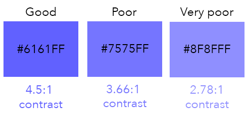
The blues shown in the swatches above are not too dissimilar. The first one (#6161FF) has exactly 4.5:1 contrast ratio against white. The second one (#7575FF) has a 3.66:1 contrast ratio against white. The third one (#8F8FFF) has a 2.78:1 contrast ratio against white. If your brand guidelines calls for #7575FF, you can get appropriate colour contrast by darkening the colour slightly to #6161FF. Very few people would be able to tell the difference without having the brand guidelines beside them for comparison.
Going from a brand colour #8F8FFF to #6161FF starts to make a visible difference. But once again, the difference is more marked when the colours are put side by side. Arguably, the user experience of the colour will remain similar if they only look at the site, with no comparison to the brand guideline.
- Previous: Conversation with Josh Simmons
- Next: Heading headache